Background
As part of a larger product redesign, I developed a design system to support scalability, consistency, and developer handoff. This system is continuously growing and currently powers the Pumble’s UI.
The system includes a library of reusable components, tokenized styles, and annotated Figma files that make collaboration between design and development even more successful.
Foundations
To ensure visual consistency and flexibility, I defined a set of design tokens:
- Colour palette: Semantic colours with light and dark theme variants. These colours are aligned with iOS & Android’s native UI style.
- Typography: A type system with clear hierarchy and font weight variations.
- Spacing: Scalable unit system based on the powers of 2 (4, 8, 16, 32...), which ensures consistency and simplifies layout.
- Effects: Elevation and shadows, blur and translucency effects (important for aligning our dark theme with the guidelines).
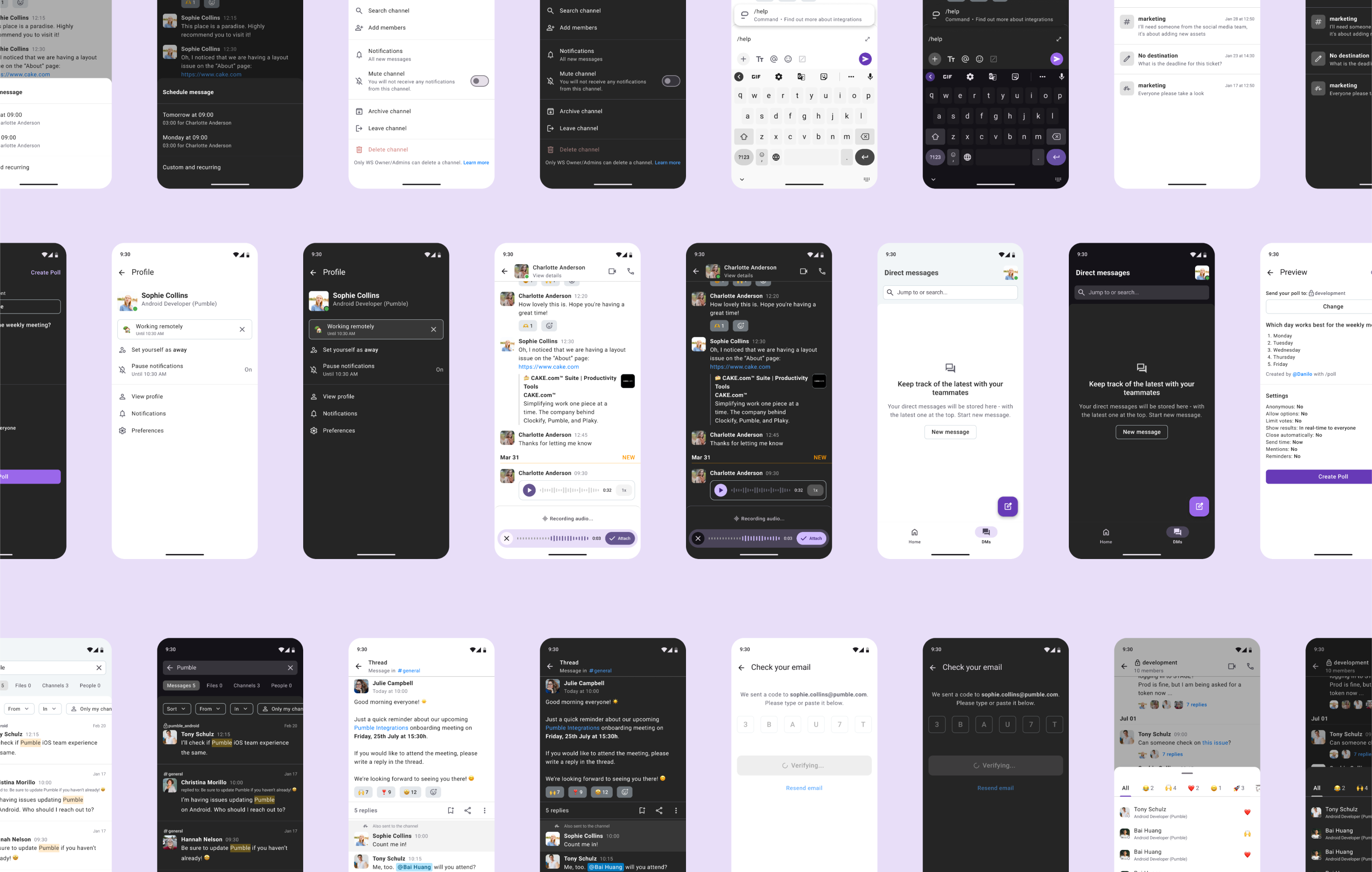
Component library
The design system currently includes over 20 components, built with scalability and responsiveness in mind. Each component is documented with a description, instance guidelines, and an example of how to use it. Here are a few examples:
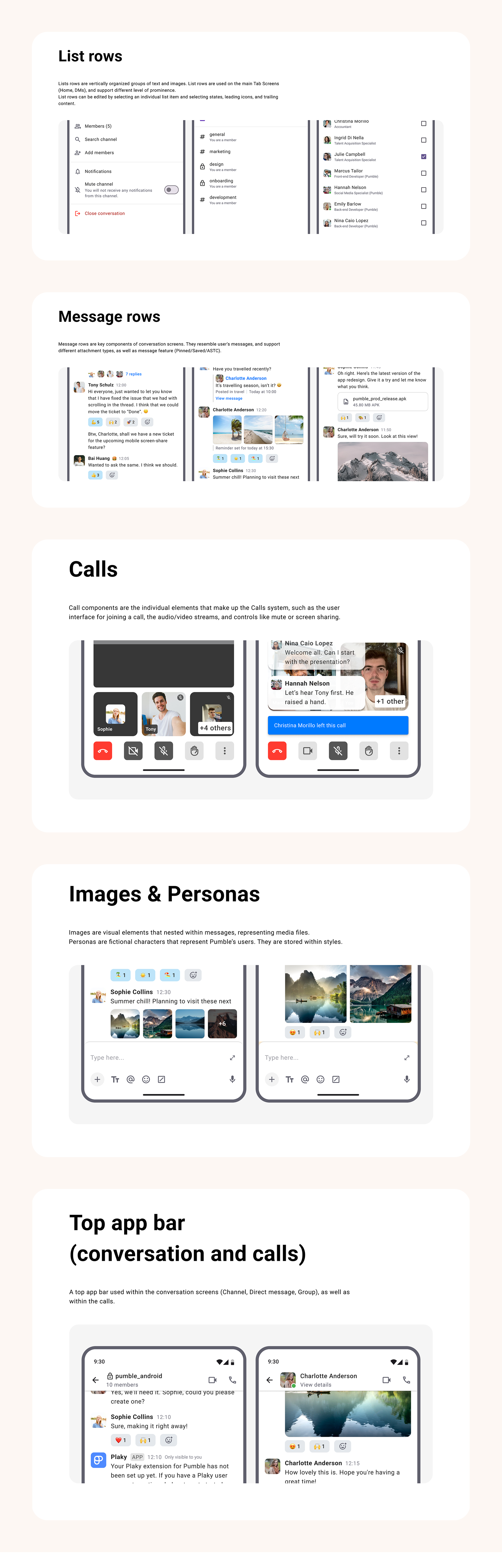
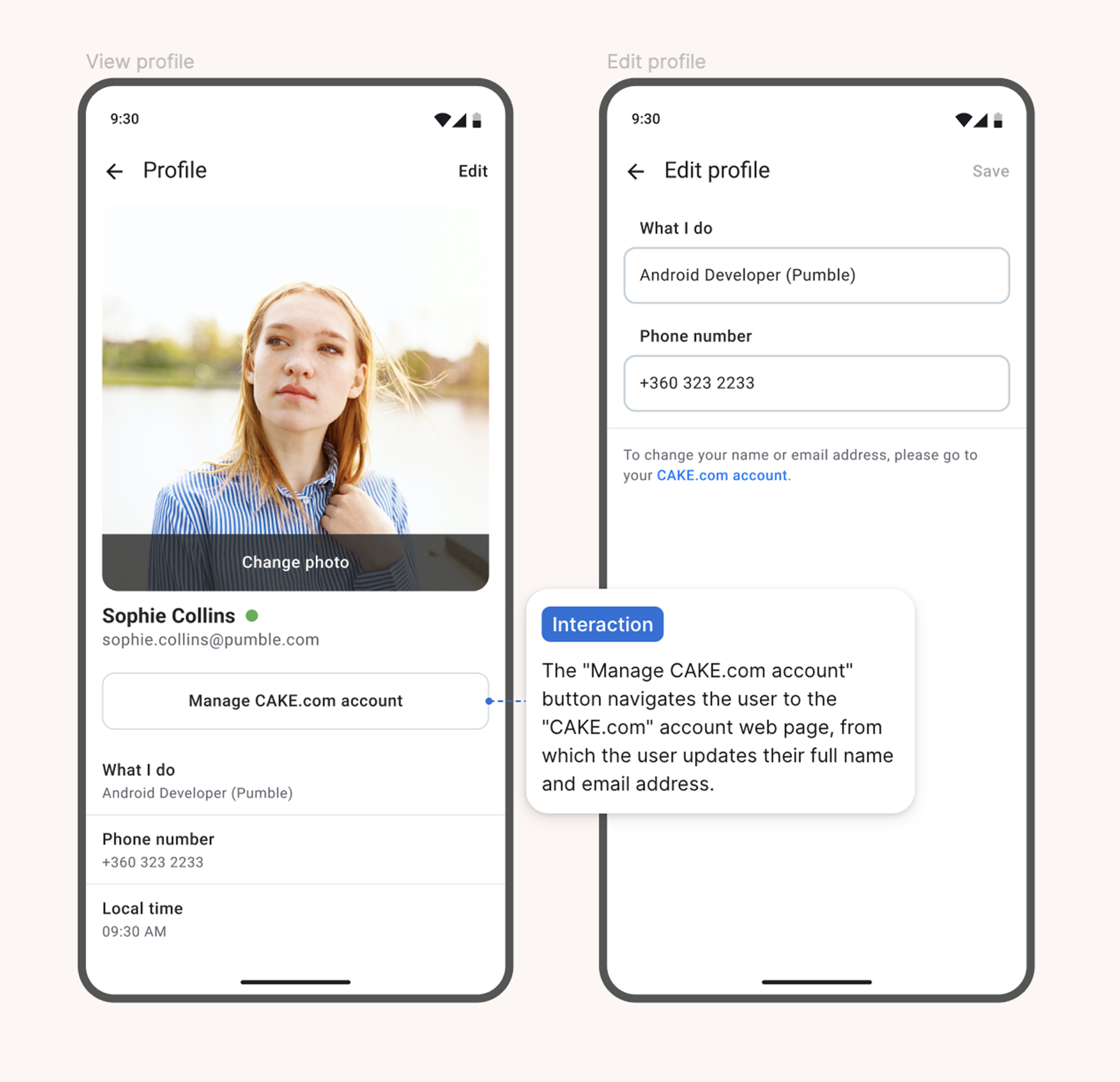
Component anatomy
Each component in the system is built using atomic principles, starting from basic elements like icons and text, and combining them into scalable, reusable modules.
This atomic approach ensures consistency across variants, easier updates, and more efficient developer handoff.
The flexibility and modularity of each component allow for easier screen updates, from swapping states to introducing new features.
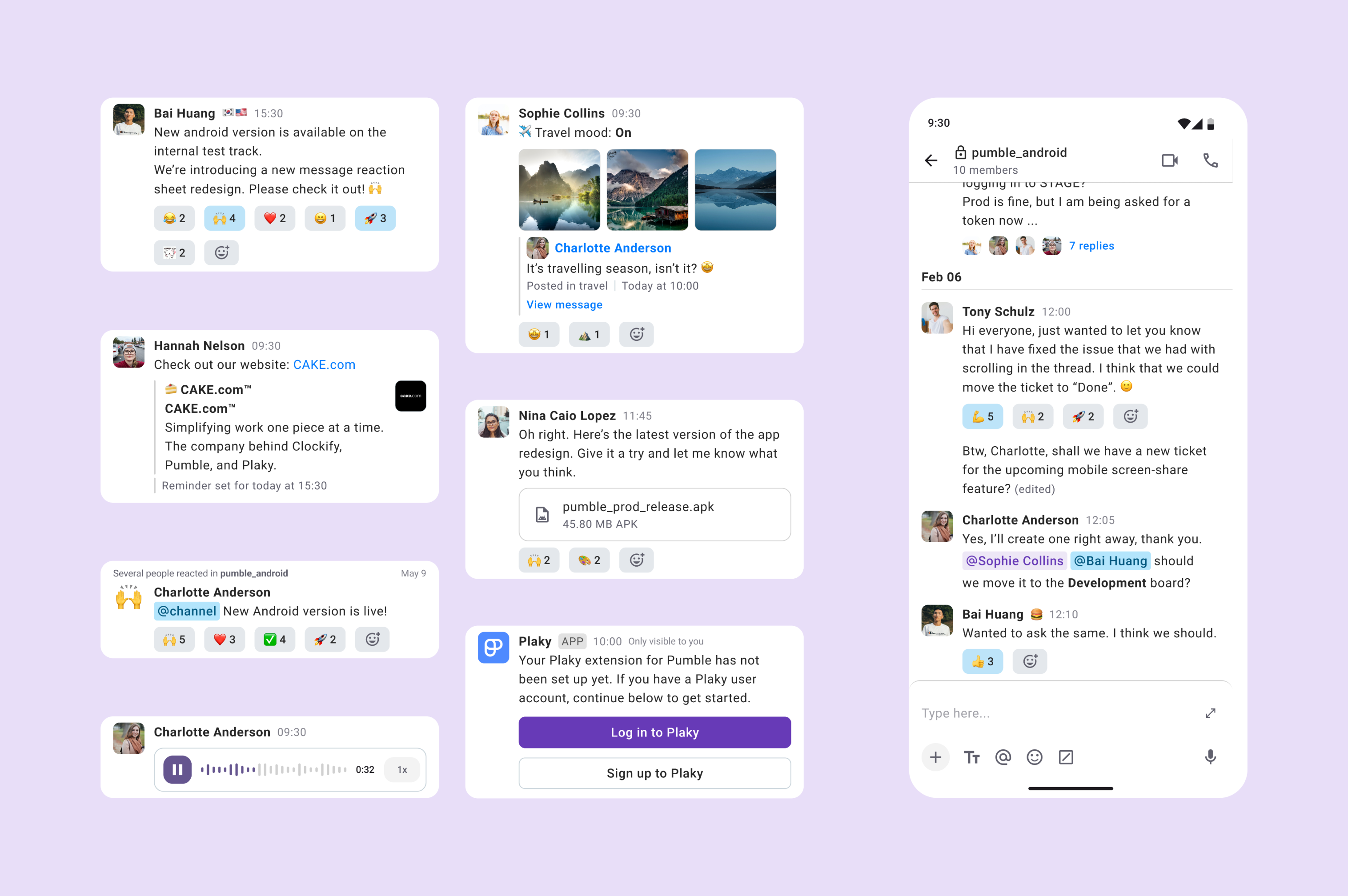
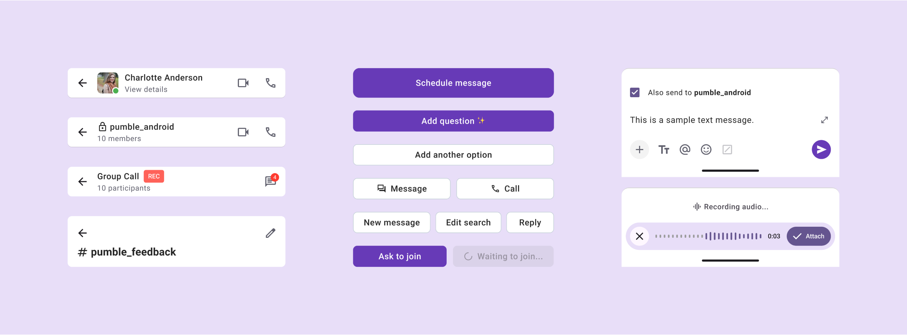
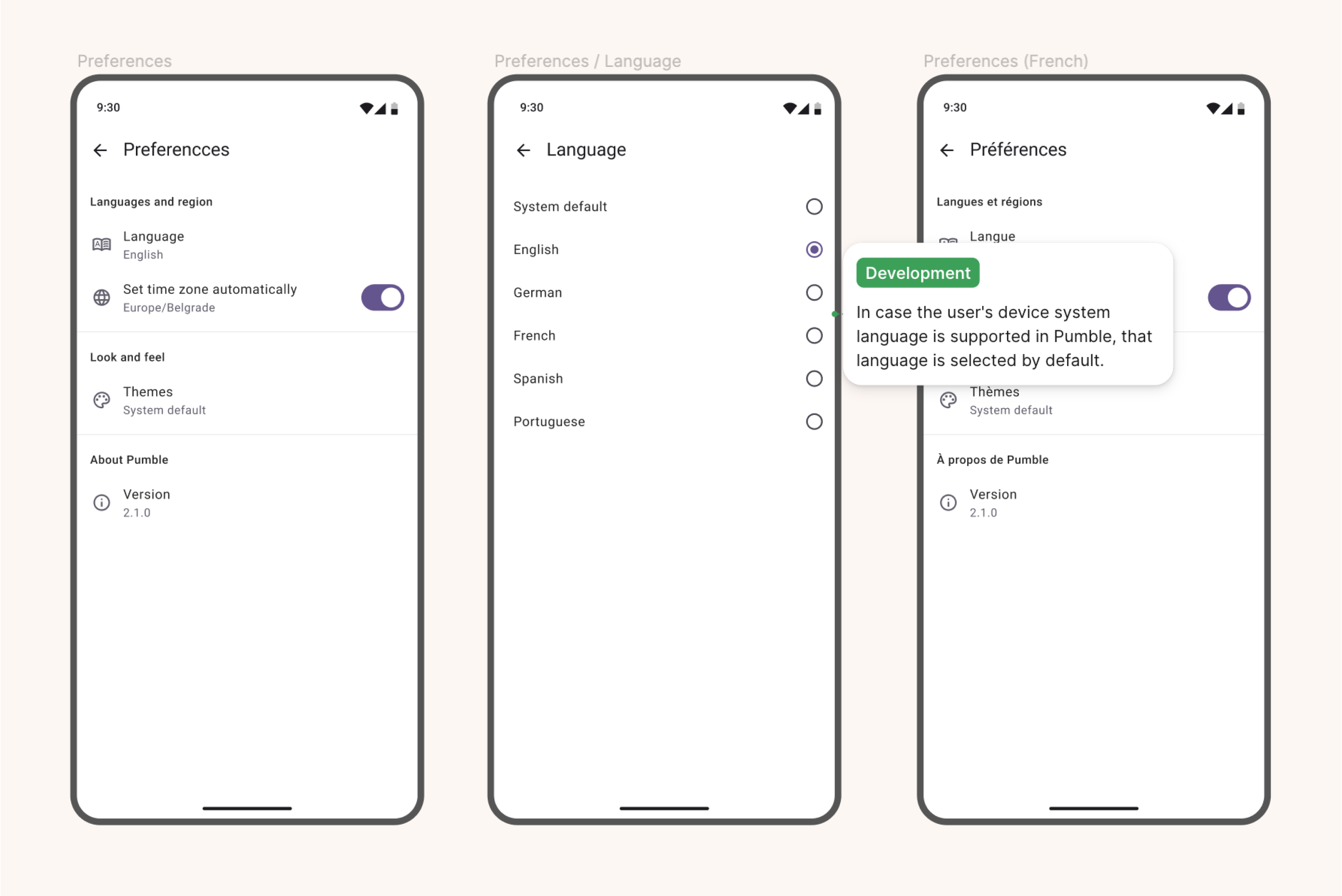
Refactoring UI
The design system was applied to all screens. Each screen was refactored to use components from the library, ensuring consistency in spacing, typography, and interaction patterns.
By applying tokenized styles and atomic subcomponents, the redesigned screens now scale more easily for new features.
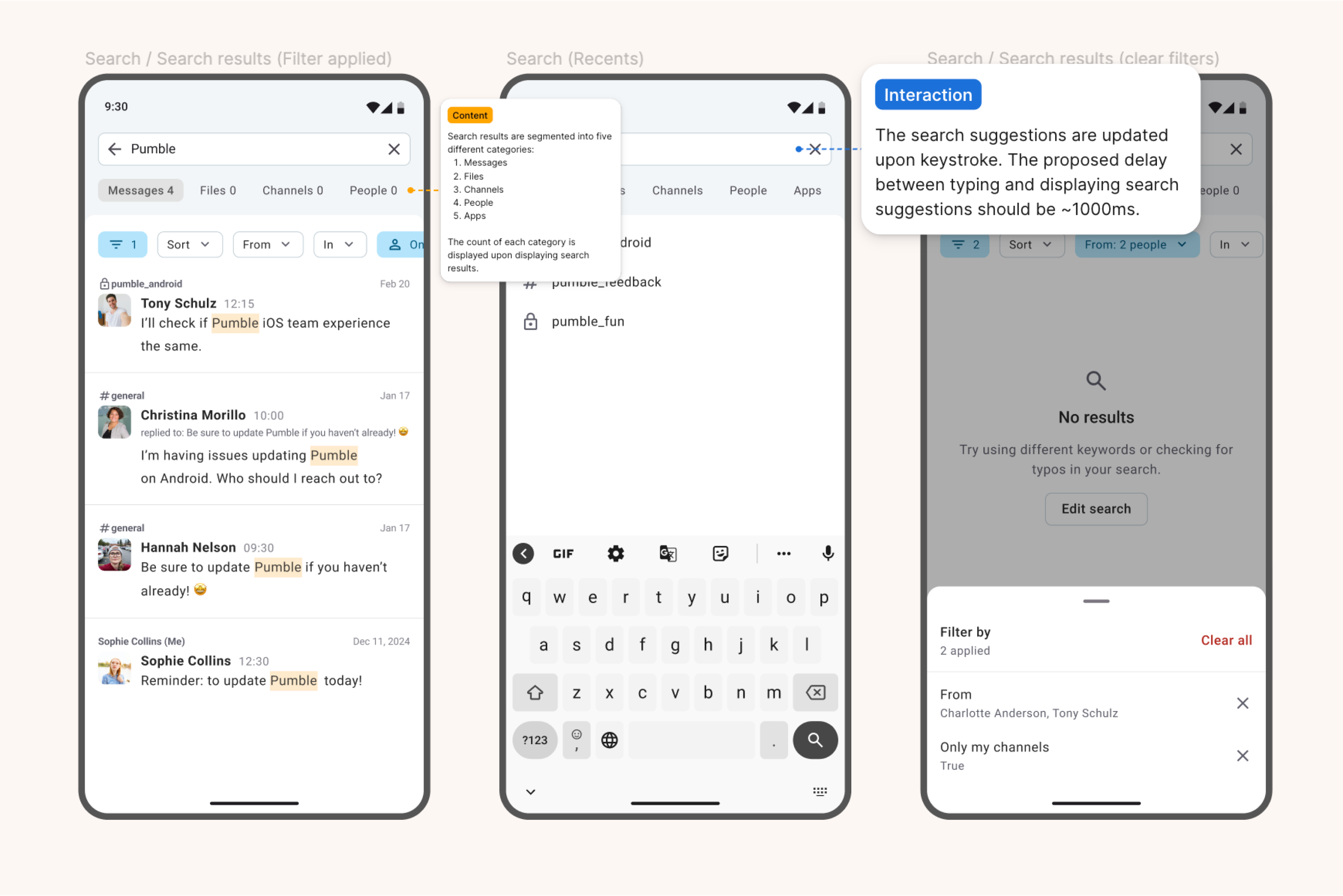
Developer handoff
To support smooth collaboration with developers, I use Figma annotations and structured file organisation. The structure is composed of playground for ideation, validation for sharing feedback, and production for final designs.
Impact & Next steps
The design system has already improved consistency across the product, reducing developer questions and concerns during handoffs. The improved guidelines and documentation make it easier for other team members to step in and work on the design. Additionally, transitioning between light and dark mode is now a piece of CAKE(.com). 😉
Next steps include expanding component coverage, improving documentation, and integrating with the upcoming Material Expressive and Liquid Glass design systems.