Background
Pumble is a free team messaging app that allows teams of all sizes to communicate and collaborate. Unlike other team messaging apps, it offers unlimited user and message history, user and workspace administration tools and 24/7 web support – all for free. It’s available on all platforms, primarily as a web browser app, but also accessible on desktop - Windows, Mac, Linux, and mobile.
One year ago, I joined the Pumble team as the leading product designer for iOS and Android devices, ensuring the best smartphone experience.
What wasn’t working
The most user-friendly business communication app for all kinds of teams, Pumble strives to keep companies productive and simplify their workload. To achieve this, one of its core attributes is flexibility, offering a more focused experience to everyone, anywhere.
And while Pumble evolved a lot over the last course, we found mobile devices to be a bit behind the desktop app. Pumble on iOS and Android did not feel as productive, joyful and responsive.
- Outdated patterns: With the release of the latest iOS 17 and Material 3 design system, many of the current patterns have been deprecated, whereas new library components have been introduced. This made the app not feel up-to-date with the latest updates.
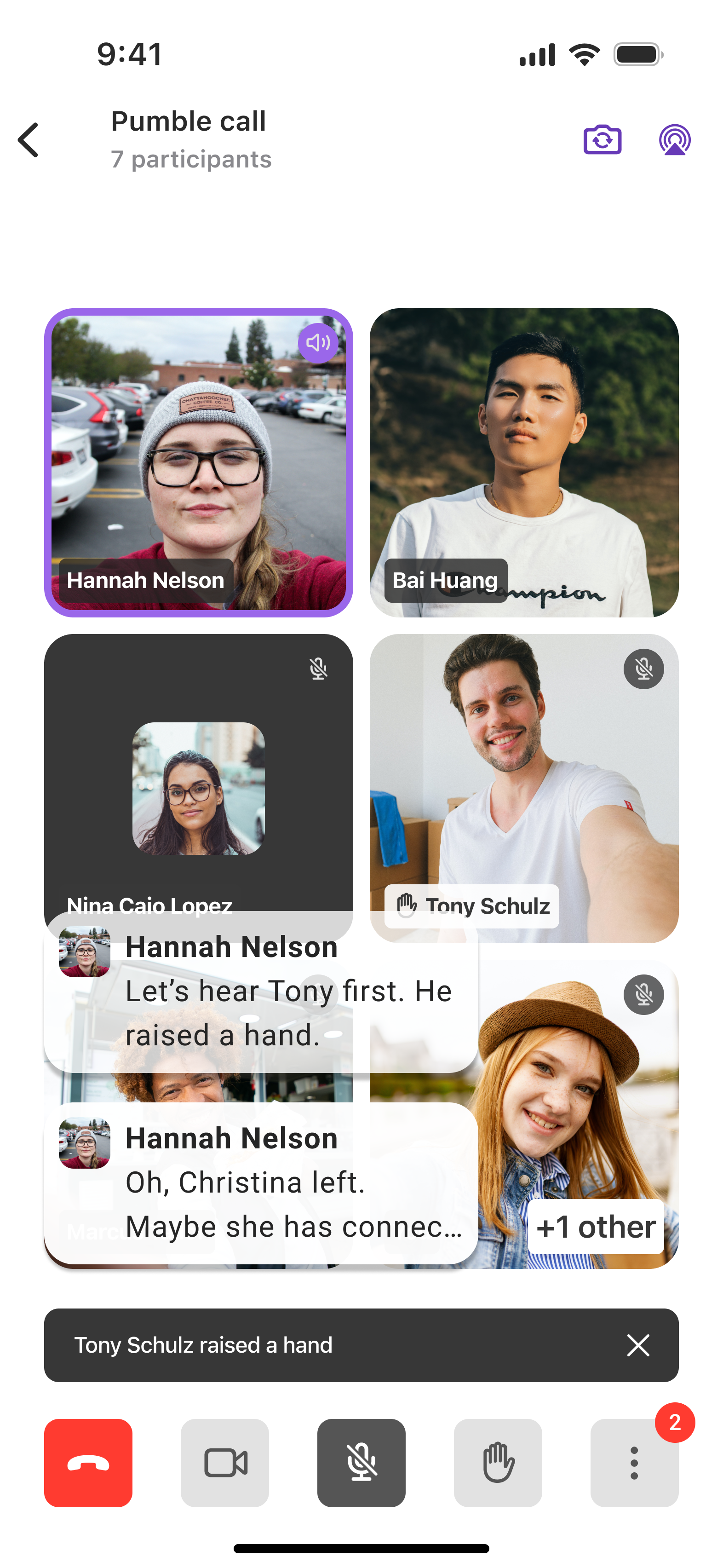
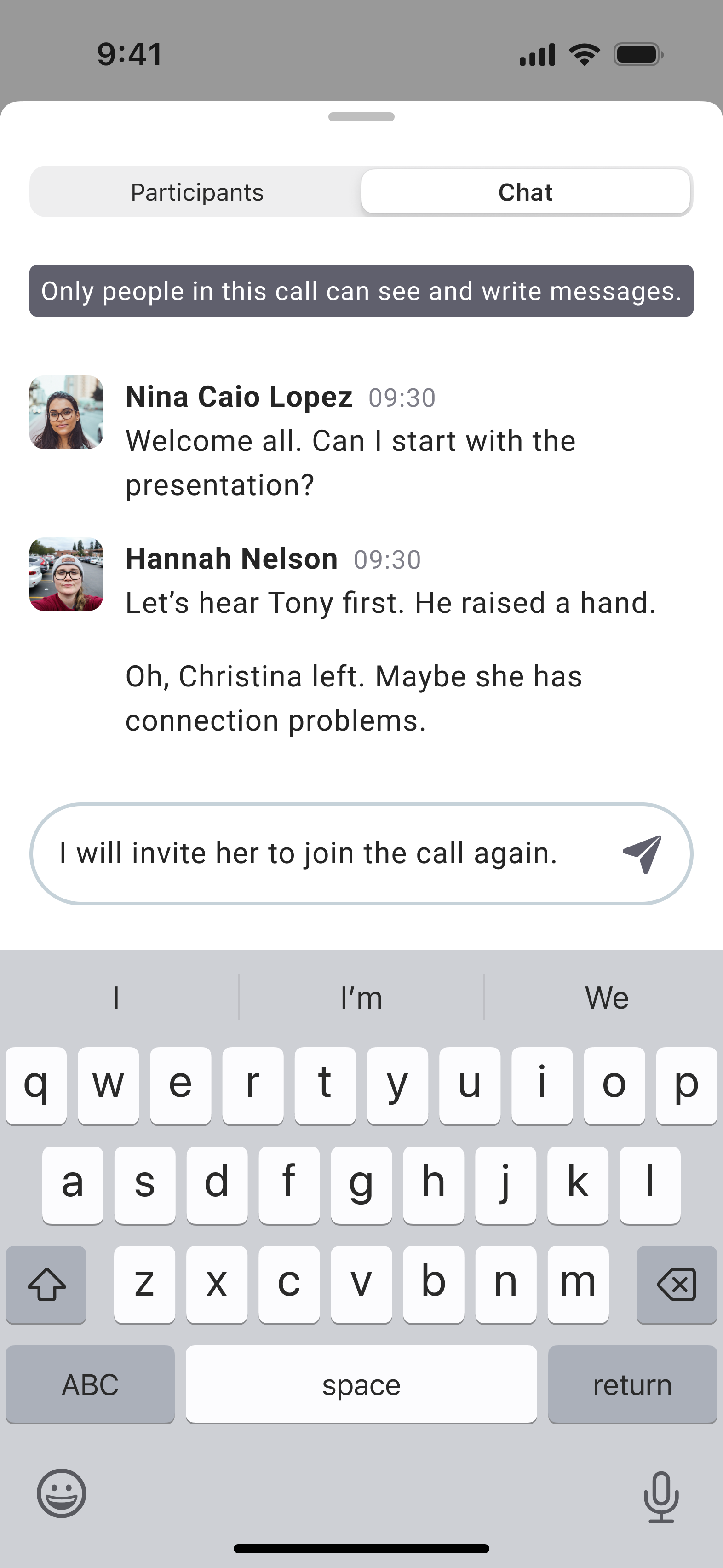
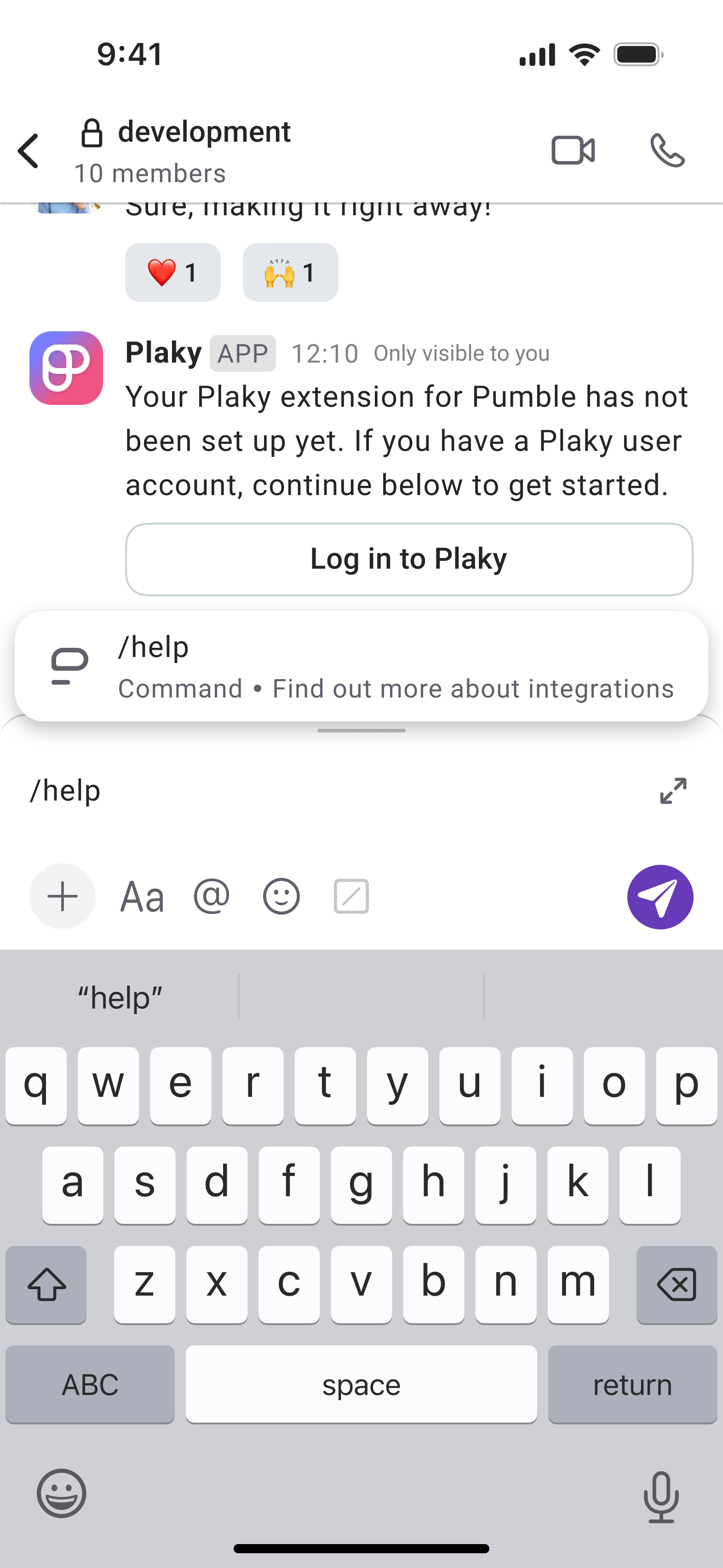
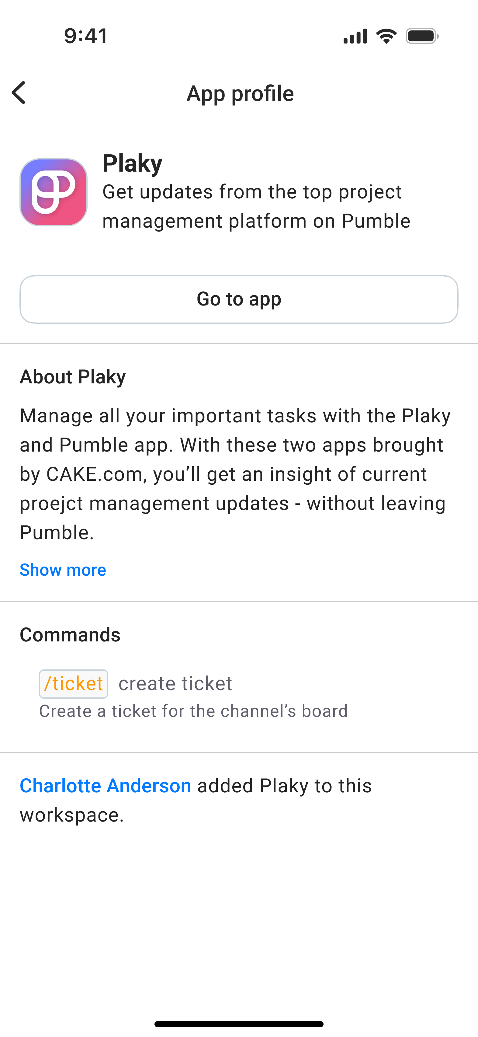
- Missing features: Many of the features launched on the desktop app, such as in-call messaging, raising a hand, and integrations, were missing on iOS and Android devices. It impacted people’s ability to catch up, search effectively, and be productive on the go.
- Accessibility concerns: The colour contrast on mobile devices wasn’t adhering to the guidelines and recommendations, especially for the dark theme. The font size wasn’t appropriate, and often left the text truncated. This made it a difficult task for users with vision impairments to stay productive and make a difference between important messages and ordinary ones.
Redesigning the look and feel
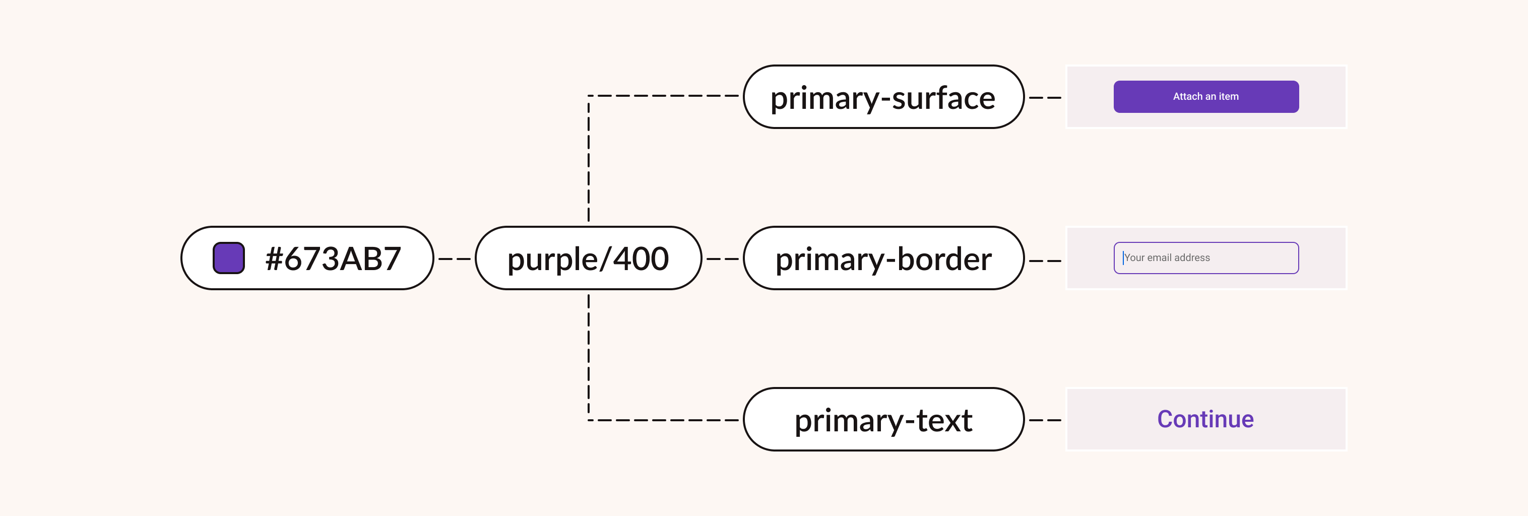
I started tackling this challenge with design explorations and getting to know our customers, taking into account our product roadmap. In the visual world, the design system has been updated to accommodate the latest additions. I have also generated colour tokens with assigned semantic roles, adhering to the recommended colour contrast ratio and ensuring ongoing consistency.
Throughout the process of redesigning the app, I was in daily sync with the development team, including them in the get-go of the process, and collecting their feedback throughout the lifespan of a product. My background in computer science helped me discover possible technical constraints.
Note: Due to confidentiality reasons, sensitive information such as the user data, as well as the research phase, cannot be shared publicly.
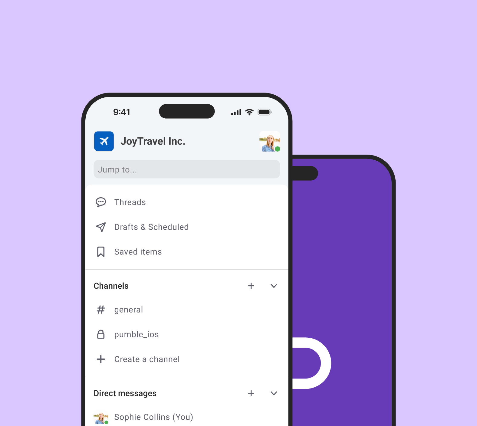
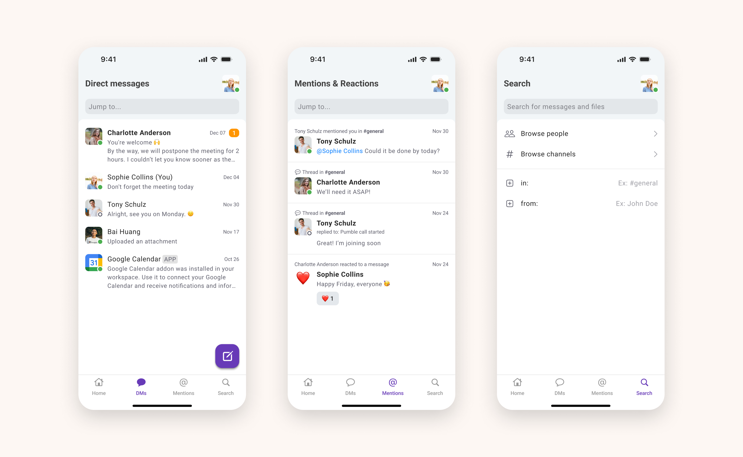
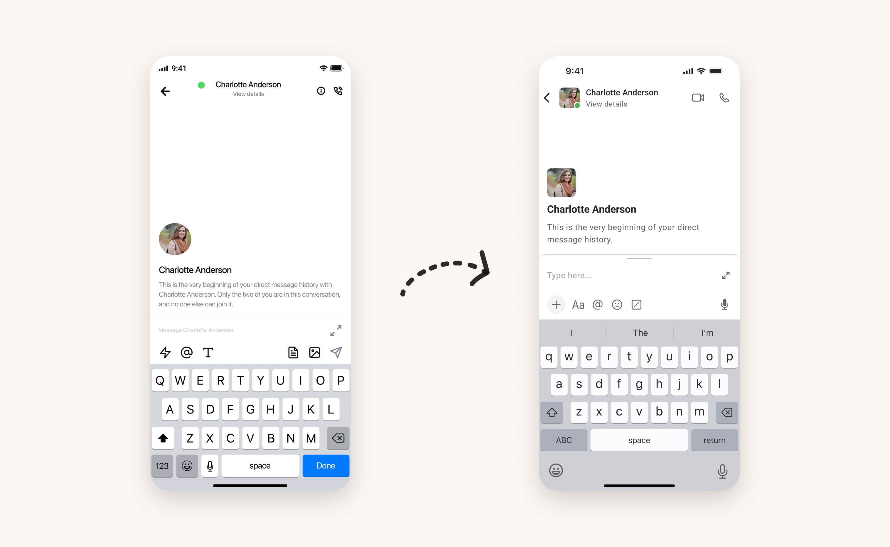
App bar structure
Tab bars let people navigate among different areas of an app, and also reflect core tasks that could be accomplished. As each additional tab increases the complexity of the app, we decided to ease people locating the information by moving the “You” tab up in the navigation bar.
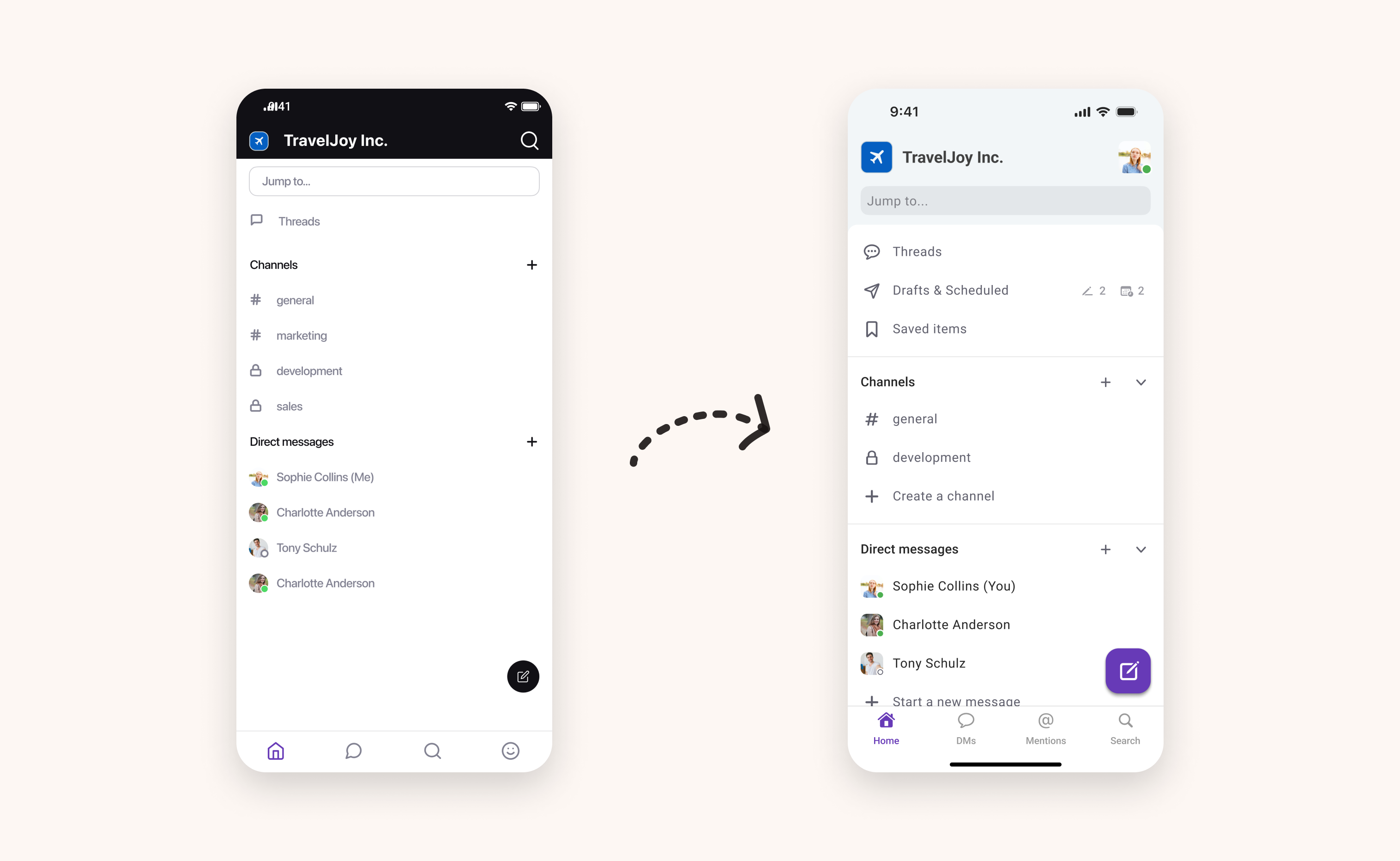
We redesigned the DMs, Mentions & Reactions and Search tab, too, and decided to use a floating button for composing a message as our most important action on the screen.
Message input field
Pumble’s message input field supports text formatting and attaching a variety of media types, but having all shortcuts in one place made it overcrowded. Thinking of future improvements and additional features, we organised the field into different subsections.
On top of that, we updated icons to the newest Material and SF Symbols. In terms of accessibility, we adjusted the touch area and designed pixel-crisp custom symbols, for a fine user experience.
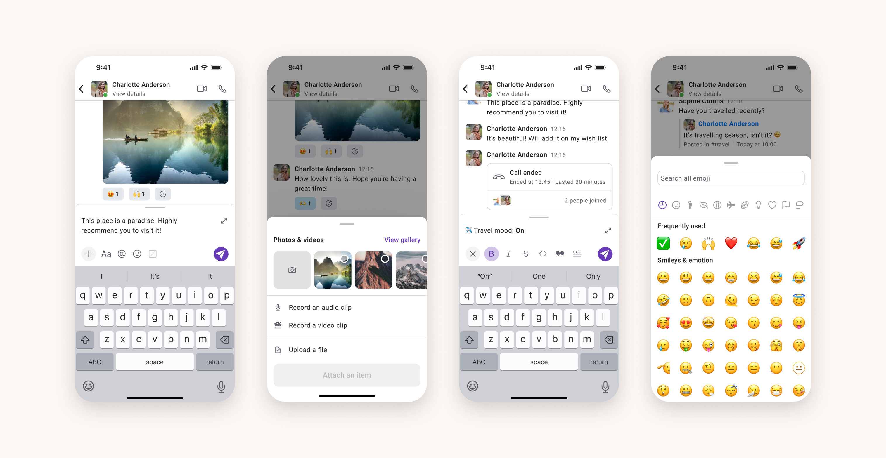
Channel conversation and direct messages
We knew that redesigning team communication, a core feature of the app, should be not only intuitive and cohesive, but also convey how it works and looks on the desktop app, too. As we are designing for the limited screen size, our main goal wasn’t just placing what fits on the screen, but rather what the end user’s goals really are and the most efficient way to provide that.
That’s why we emphasised adhering to the accessibility traits, from touch area size, over colour contrast and font sizing, to layout consistency.
We also enriched our colour palette for dark mode, ensuring our content is comfortably legible and pleasing.
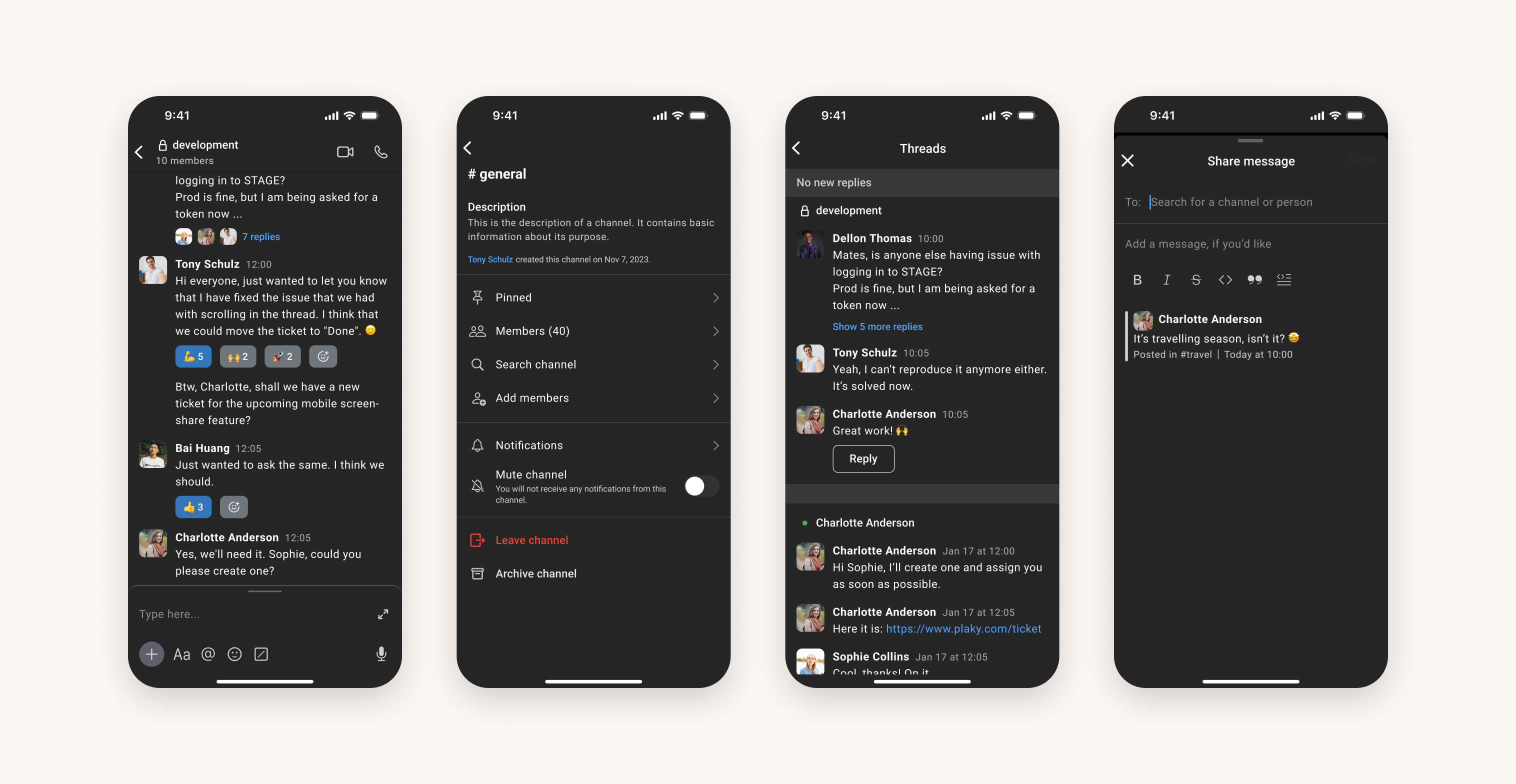
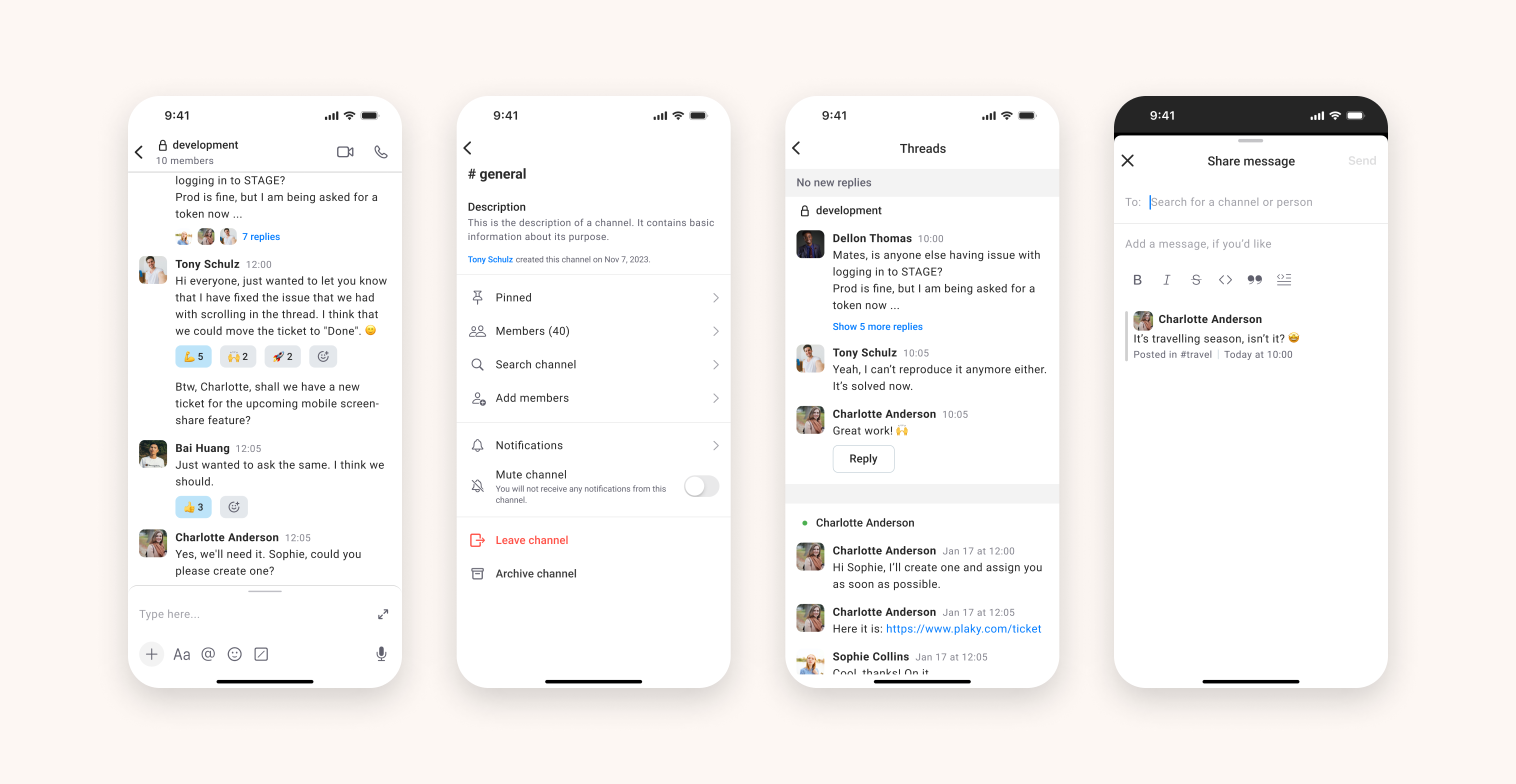
Additional features
We conducted a design audit, updating each part of the app - all icons, every button, and each component. Apart from redesigning the UI and flow of the mobile app, we also worked on adding features that were present on the desktop app.